
foodys
UX Design Case Study
My Role
UX Researcher
UX Designer
User research
User interviews
Building User Personas and stories
Wireframing
Prototyping
Project Duration
March 2nd, 2022 - September 3rd, 2022
Project overview
About Foodys App
Foodys is a food reviewing app, the user can review different restaurants and menu items, as well as looking up and discovering restaurants based on location, ratings and preferences.
The problem
Sometimes users experience difficulty when expressing their opinions on the food they order at restaurants, as ell as difficulty to make up their mind on what to order or where to go out to eat.
The goal
The goal is to help the user by giving them a platform where they can voice their opinion and find new restaurants based on ratings, preferences and location.

User research
Summary
The research method I followed was qualitative research based on one on one interviews with six target users.
The target users were people who go out to eat at least once a week. I considered male and female users in an age range of 21 to 62 with various occupation.
User Pain Points
Indecisiveness
Based on research, the user struggles to make a decision when choosing a place to eat or a dish to order at a restaurant. The app will be designed to make the decision process easier for the user.
Voice Opinion
Based on research the user struggles to voice their opinion when expressing their thoughts on the restaurant's service and food quality. The app will have a review making feature.
2
Review Menu Items
Other reviewing apps don't have the option to review menu items. The app will have a feature where users can review menu items from different restaurants.
3
User Persona

"Going out to eat is a treat for me, I don't like to waste my money on an unpleasant experience"
Goals
-
To enjoy her fridays with her friends.
-
To be able to give her opinion without the confrontation.
-
To spend her money on pleasant experiences.
Frustrations
-
"I don't like confrontation, so often times when I don't like the dish I ordered, I don't complain to the waiter"
-
"I don't like to spend my money on food I don't like"
Daniela Hernández
Age
Education
Hometown
Family
Occupation
26
B.A. in Marketing
San Luis Potosí, México
Single
Marketing Freelancer
Daniela works from home as a Marketing Freelancer, she likes to treat herself on Fridays and go out to dinner with her friends. She goes to the same four restaurants and sometimes the food quality isn't great, she doesn't like confrontation and doesn't complain to the waiter, but feels that she's not getting her money worth.
Problem Statement
Daniela is a Marketing Freelancer who needs a way to voice her opinion about dishes that she disliked at restaurants because she doesn't like confrontation and wants to feel heard.
User Journey Map
Goal: Give her opinion on a dish from a restaurant.
Action
Task List
Feeling
Adjective
Improvement
Opportunities
Find the app
Task:
-
Take out her phone.
-
Open the app
Focused
When the user opens the app, there could be a "Welcome Back" pop up vibration.
Find the restaurant on the app
Find the dish she ordered
Task:
-
Search for the restaurant on the app.
-
Select the restaurant.
Task:
-
View the menu items
-
Search for the dish she ordered.
Confused
Impatient
The restaurant could have a QR code to scan with the app to make it easier for the user to find the restaurant they're in.
The user can search with voice assistance.
Overwhelmed
The user can search with voice assistance.
The app has listed dishes with pictures and a written description.
Leave a comment
Leave a star review
Task:
-
Click on the dish she ordered.
-
Leave a comment.
Task:
-
Finally leave the general star rating on the dish.
Focused
The app could have specific ratings like: taste, presentation, temperature, etc.
Satisfied
The app could have a reward system based on how many dishes the user has reviewed.
1
Starting the design
Paper wireframes
These are some of the rough sketches of the Foodys app paper wireframes.
%2011_39_33.png)
%2011_41_01.png)

Home screen
Search screen
Restaurant Profile screen
Digital wireframes
A recommended section for recommending restaurants based on the user's preferences,
%2011_41_53.png)
Home screen
Bar graph displaying the star ratings.
The search can filtered out based on ratings, location, opening time, etc.
%2011_42_13.png)
Search screen
%2011_42_29.png)
All the restaurant's profiles will have this section of "best reviewed dishes".
Restaurant Profile screen
Low-fidelity prototype
The lo-fi prototype follows the user flow for publishing a review on multiple menu items from a specific restaurant.
%2012_54_41.png)
Usability Studies
Usability studies were conducted via online, with the participation of 5 potential users (3 woman, 2 males from the ages of 21 - 60). A list of tasks were presented to participants and they answered following questions related to the tasks.
Round 1 findings
More visibility for the "Add Review Button".
1
Users need more guidance when making a review.
2
Users want multiple ways to make reviews.
3
Round 2 findings
Users need pricing on menu items and on restaurant profiles.
1
Users want less steps in the review making process.
2

Redefining the design
Mockups
I added prices to menu items, and price range to the restaurant's profiles.
I also changed the apps orange color to red, for better visibility.
After 1st Usability Study
%2011_42_29.png)

After 2nd Usability Study

After 1st Usability Study
After 2nd Usability Study
%2021_43_51.png)
%2021_44_06.png)

%2021_43_03.png)
%2021_43_25.png)
%2021_43_40.png)
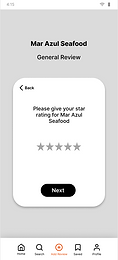
I simplified the review making process. Instead of having separate screens for each step of the review, I included all steps in one screen.
There are less screens, therefore it's percieved to be less steps.
Accessibility Considerations
I Changed the orange color that I first selected to the red, because it didn't pass the contrast ratio WCAG.
1
I made the fonts in general bigger, so they can be read easier. Added more icons in the design.
2
In the user profile screen, I added the option to change the language of the app.
3
%2022_07_05.png)


Takeaways
Impact
Foodys could really help users who struggle with decision making when choosing where to go out to eat and what to order at restaurants and other establishments. It could be a way to find new places.
What I learned
Since this is my first UX Design project, I learned the steps of the UX Design process, as well as UX research.
Next Steps
To take the project to the next level. Completing a final round of Usability Studies to test the final version of the app.
1
Find a way to make this app a reality. Connect with app developers.